
KinderMountain
BRAND IDENTITY
When the founder of KinderMountain reached out, she had a clear vision for her children’s outdoor apparel brand, but her DIY logo felt too close to an existing brand and didn’t capture the adventurous, playful spirit she wanted. Her goal was simple: create a clean, timeless logo that parents would trust and kids would love.
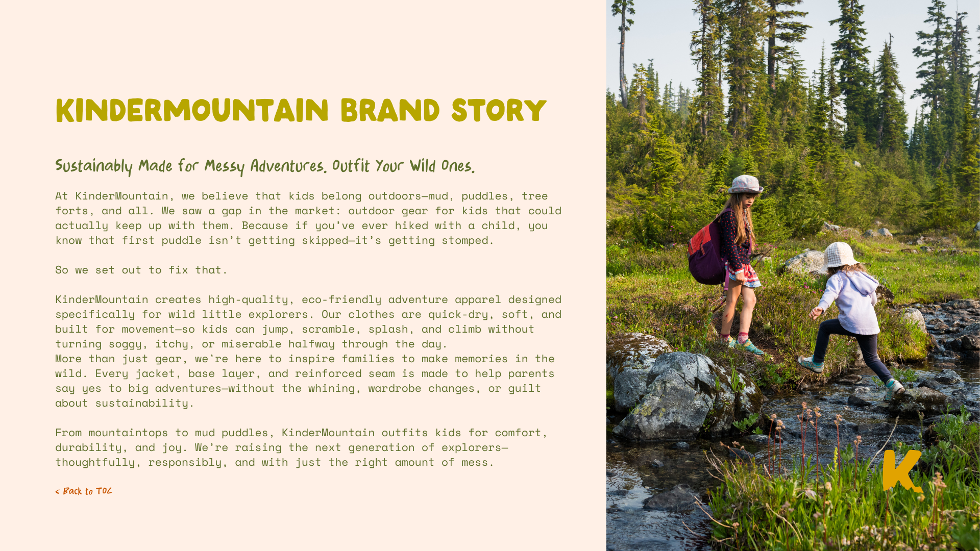
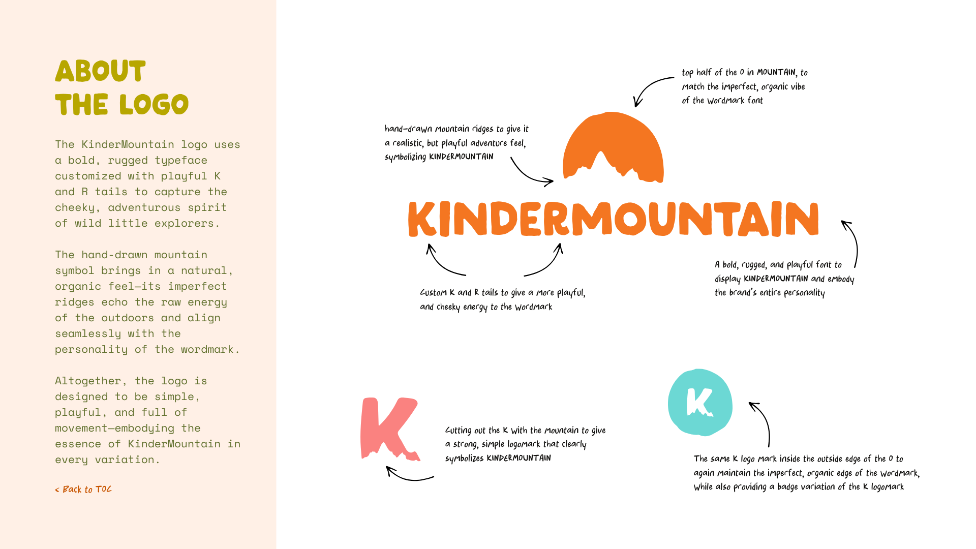
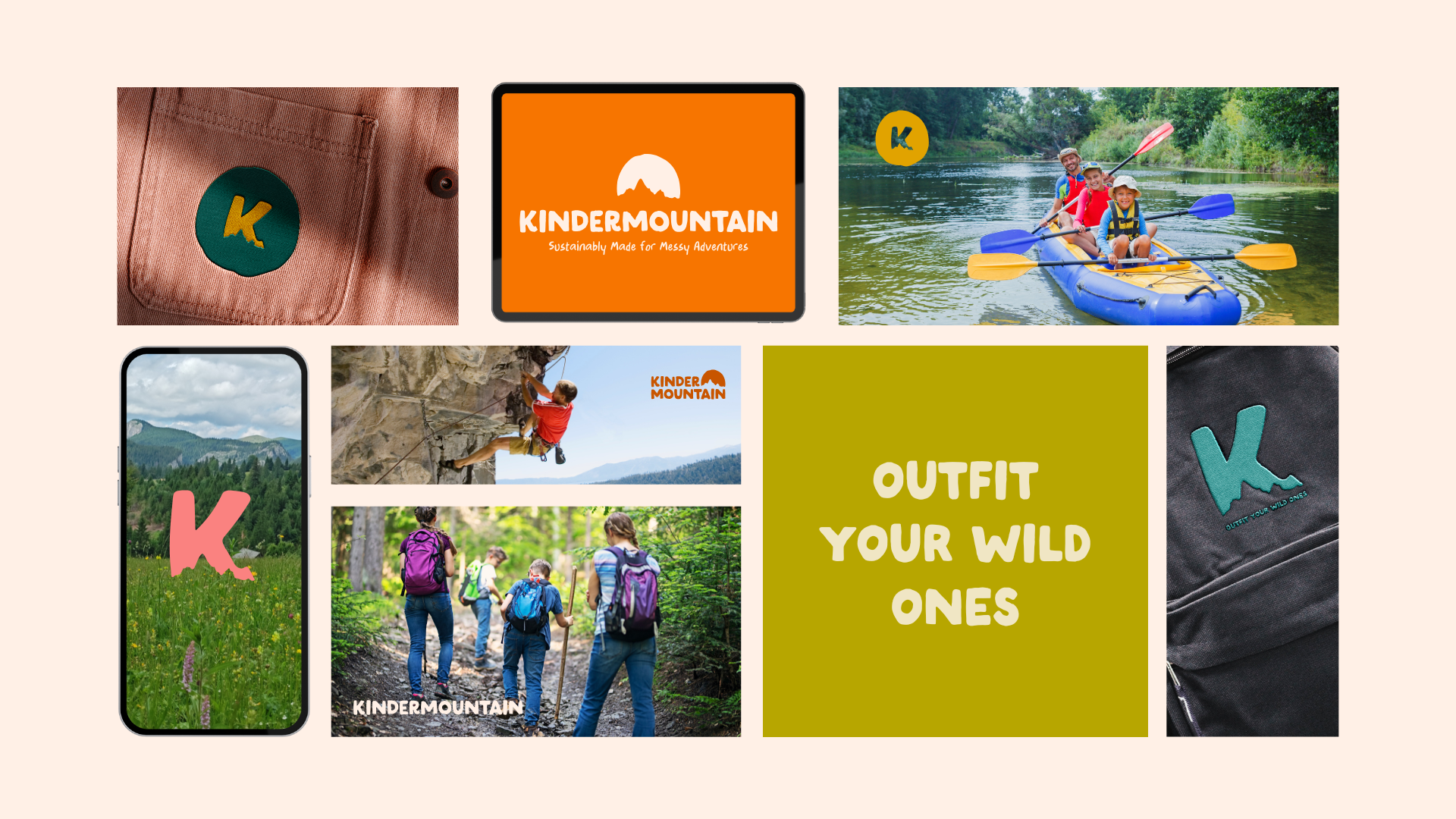
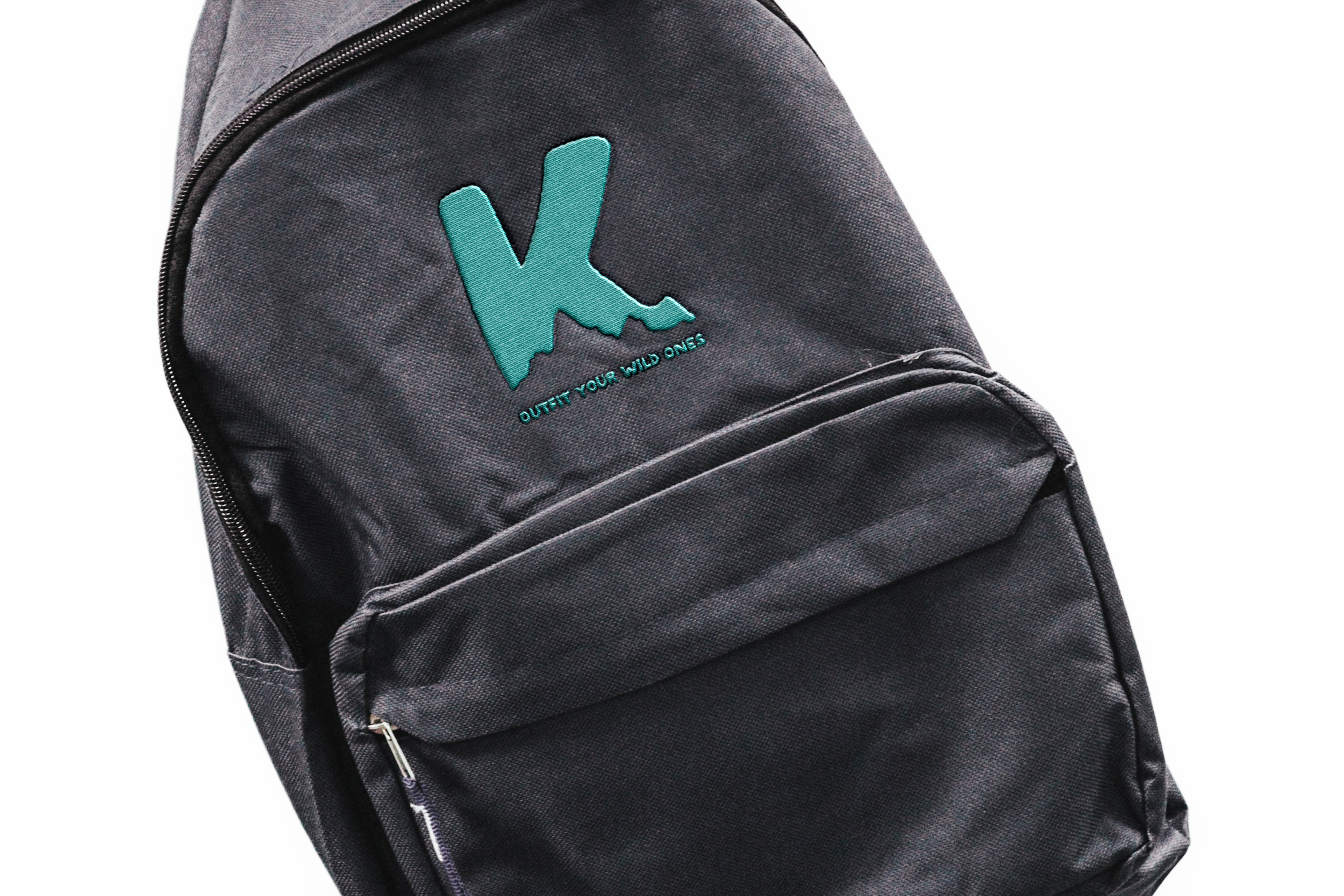
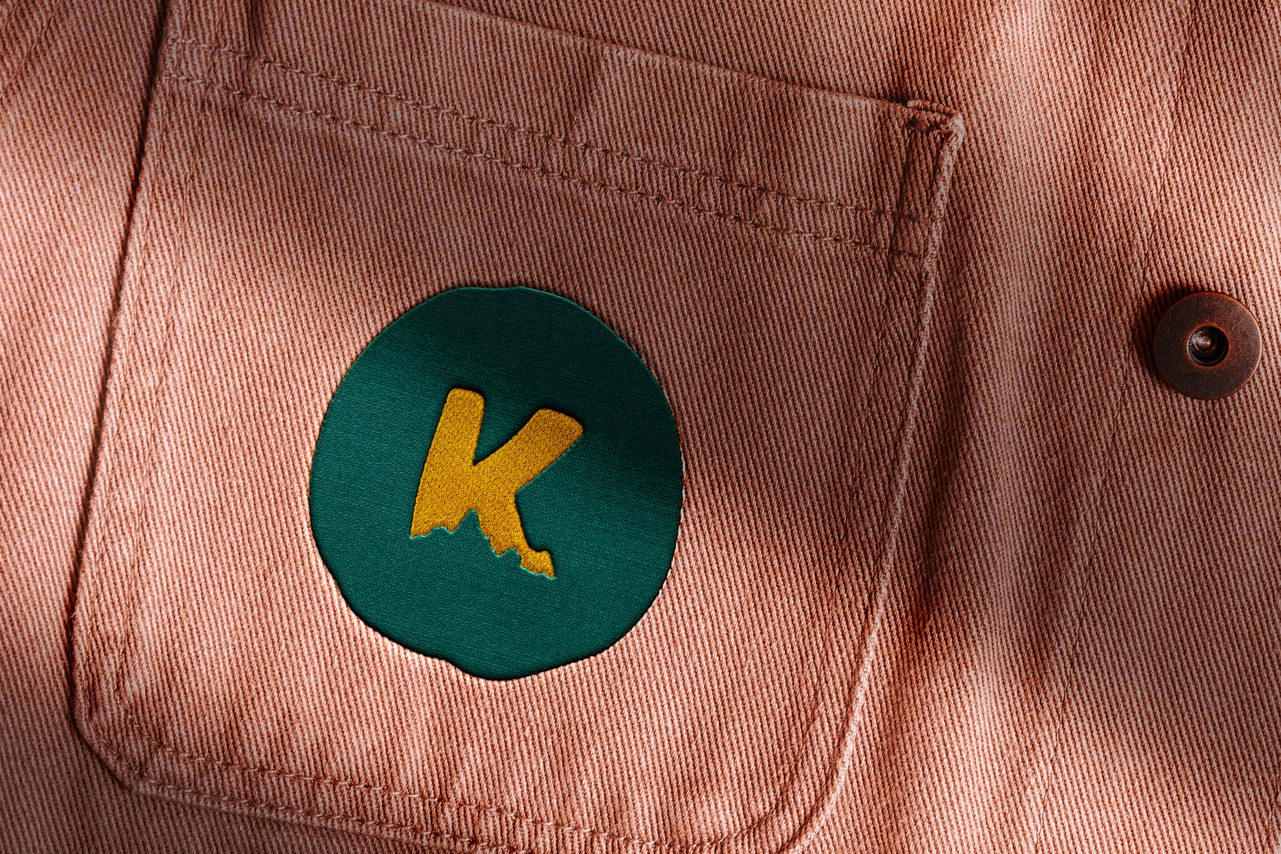
Together, we built a bold, kid-centric identity that blends rugged adventure with everyday play. From the hand-drawn mountain ridges to the custom typography, every detail was designed to reflect durability, movement, and imagination, which are core values that define KinderMountain.
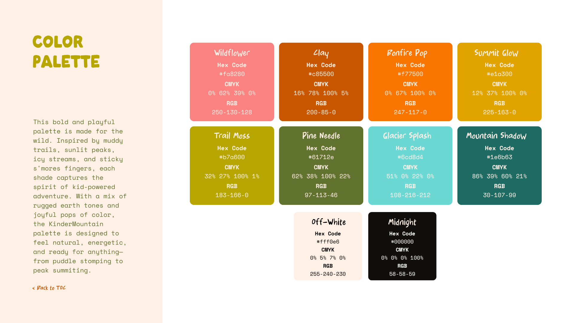
The final logo suite, color palette, and brand system equip KinderMountain to grow confidently into a recognizable, purpose-driven outdoor brand, one that celebrates muddy boots, big hearts, and family adventures that last a lifetime.


“Brittany was easy to talk to, work with, and nailed the vision I had! She listened to feedback and made adjustments that I requested. She did an amazing job of bringing my brand to life and provided clarity on the steps I need to take to move forward with my startup.”

